Contrast in Type
When creating layouts and type it is essential that the right colours are used. Colours change the way people look at everything, from advertisements to articles. Normal black and white can be formal and official yet very simple and minimalistic. Colours like red are very powerful and are instantly the first colour that is seen on a page. This is the reason why advertisers use red and other bright colours to help gain attention. When readability is achieved, the next thing to look at is what effect it adds to your text. It can add drama or be completely neutral, which is why many designers try and avoid colours that would otherwise make it harder to read.

This image clearly shows the difference when the colours in text are changed. The text with black on white is more sophisticated and formal, and could be for an article of some sort. It is very easy to read as well as being a serif typeface.The white on black text looks more of a display font, as the use of the Impact font in my opinion is not the best font for readability, and in an article would be difficult to read.
Legibility
Legibility is how well you can read each individual letter making up a word in type, and is not to be confused with readability, which is how well you can read each word in a paragraph. To make a typeface legible, a few simple tricks can make all the difference. First is the X-height. A large X-height can almost 'stretch' the letters out, making them easier to read. Also negative space is also to be considered when creating type, because it makes the strokes more distinguishable. The actual typeface also matters in terms of legibility, as a sans-serif font will likely always be easier to read than a serif font, mostly because of the lack of other distracting elements.

Readability
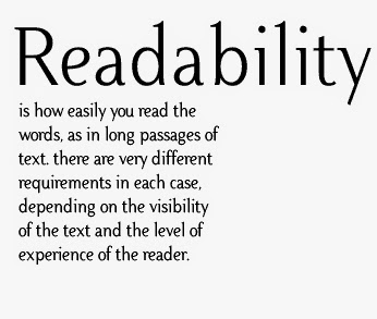 Readability, in its simplest form, is basically how easy a body of text is to read. It refers to how well you can scan over a paragraph and is very important in many mediums such as magazines, websites and books. While legibility is about how well the letters of a typeface can be read, readability is about the manipulation and handling of typography.The main factors that affect readability are line lengths, leading, spacing, type alignment and the background.
 Font Size
In typography, font size heavily depends on what style and design you are trying to achieve. You need to have a big enough size font to be able to read the text but not too big that it takes up too much space in your design/article. You also do not want your text to be too small, as there will be many people reading your text, which means there will be some people who find it hard to read. Small text at any level will be hard for most people to read, so this is usually avoided.

Leading
Leading and line spacing is the same thing. They basically mean the lines between texts and sentences, and having the knowledge of leading can help alter the density of a body of text. Texts such as newspapers are much denser than magazines or posters. Programs such as Quark XPress, MLayout and Adobe InDesign have a default setting that sets the leading at 120%. Some tips for leading would be that most long lines of text may require extra leading, and that bold fonts and sans serif typefaces require extra leading.

Kerning
Kerning means to adjust the spacing between individual letters, and is always very useful when working with type. Kerning is mostly used when a word is difficult to read and needs spacing out or when a word has awkward spacing between letters and does not look professional. It is mostly used in headlines and titles and in text that grabs attention, rather than a body of text. It is mostly confused with tracking, which is the adjustment of spacing within a word.

Tracking
Tracking is the adjustment of space in a word, and can ultimately make a word more or less dense. It helps the flow of reading through text and eliminates most chances of widows or orphans in text. This is used in many areas of text, including headlines and titles to paragraphs and body texts. Great care should be taken when adjusting the tracking, as it can make text incredibly hard to read if done wrong. It can also have great effects and works well with handwritten fonts.
