Friday, 17 April 2015

Helvetica

Helvetica is one of the world’s most famous fonts, and is used on so many things that people often dismiss it. It is used by huge corporations to independent designers, and is very influential in the world of type, so influential, in fact, that there was a film created dedicated to how Helvetica changed and affected the world. It’s been featured by MOMA in New York and has awarded many times.

Helvetica was created in Switzerland in 1957 by Max Miedinger and Eduard Hoffmann. It was originally supposed to be named ‘Die Neue Haas Grotesk’, which resembles Schelter-Grotesk. The font itself was created for the sole purpose of being a total neutral font, to have no meaning or give any impression. The marketing director at Stempel changed the name to Helvetica in 1960 to make the font more marketable overseas. Before naming it Helvetica they were going to name it Helvetia, but decided against it due to the designers not wanting to name it after a country (Helvetia is Latin for Switzerland), so they called it Helvetica instead, which means Swiss in Latin.

In the 50’s there were many logos and designs that are iconic to that era, but some companies and industries wanted change in their posters and designs. They wanted a neutral font that expressed nothing but sleekness and simplicity. This was not to forget the past design and type sense because it was bad, but because they were coming into a new age of design.

In 1898, the typeface called Akzidenz-Grotesk was created by Berthold, one of the world’s largest type foundries at the time. It is believed that this is where the idea of Helvetica was inspired and based on, as well as other designs from 1898 to 1957. Many things had changed in them 60 years, and Miedinger believed the world should have a modern font once more. It was very popular at the time and many other typefaces were based on Akzidenz-Grotesk. As Miedinger also based his on Akzidenz-Grotesk, there are many similarities between the two fonts, are difficult to see which one is which without analysing further.


Helvetica has exploded in popularity ever since it was created and has been used in many corporations and logos over time. It is the font that is used on the New York subway system, which is iconic for New York. Because Helvetica remains legible while moving, it has been used on many vehicle and airline logos, such as BMW, Toyota, Harley Davidson, Jeep, Lufthansa, and American Airlines. These are all well-known companies, and their logo helps them get recognition, which means that Helvetica is a good idea if they want their logo to be easy to read. It has also been on clothing company logos, such as The North Face, American Apparel and Caterpillar. 


Friday, 10 April 2015

Elements Of Typography

Perfect typography will not have any of its finer points noticed, as the very job they are meant to do is to not be noticed and hold the text together so that it looks clean, tidy and professional. There are many elements of typography that count for this and when these have all been perfected, the text will be perfect. 

Contrast in Type

When creating layouts and type it is essential that the right colours are used. Colours change the way people look at everything, from advertisements to articles. Normal black and white can be formal and official yet very simple and minimalistic. Colours like red are very powerful and are instantly the first colour that is seen on a page. This is the reason why advertisers use red and other bright colours to help gain attention. When readability is achieved, the next thing to look at is what effect it adds to your text. It can add drama or be completely neutral, which is why many designers try and avoid colours that would otherwise make it harder to read. 


This image clearly shows the difference when the colours in text are changed. The text with black on white is more sophisticated and formal, and could be for an article of some sort. It is very easy to read as well as being a serif typeface.The white on black text looks more of a display font, as the use of the Impact font in my opinion is not the best font for readability, and in an article would be difficult to read. 


Legibility
Legibility is how well you can read each individual letter making up a word in type, and is not to be confused with readability, which is how well you can read each word in a paragraph. To make a typeface legible, a few simple tricks can make all the difference. First is the X-height. A large X-height can almost 'stretch' the letters out, making them easier to read. Also negative space is also to be considered when creating type, because it makes the strokes more distinguishable. The actual typeface also matters in terms of legibility, as a sans-serif font will likely always be easier to read than a serif font, mostly because of the lack of other distracting elements. 


Readability
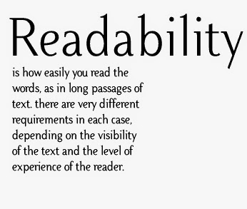
Readability, in its simplest form, is basically how easy a body of text is to read. It refers to how well you can scan over a paragraph and is very important in many mediums such as magazines, websites and books. While legibility is about how well the letters of a typeface can be read, readability is about the manipulation and handling of typography.The main factors that affect readability are line lengths, leading, spacing, type alignment and the background. 


Font Size
In typography, font size heavily depends on what style and design you are trying to achieve. You need to have a big enough size font to be able to read the text but not too big that it takes up too much space in your design/article. You also do not want your text to be too small, as there will be many people reading your text, which means there will be some people who find it hard to read. Small text at any level will be hard for most people to read, so this is usually avoided. 


Leading
Leading and line spacing is the same thing. They basically mean the lines between texts and sentences, and having the knowledge of leading can help alter the density of a body of text. Texts such as newspapers are much denser than magazines or posters. Programs such as Quark XPress, MLayout and Adobe InDesign have a default setting that sets the leading at 120%. Some tips for leading would be that most long lines of text may require extra leading, and that bold fonts and sans serif typefaces require extra leading. 


Kerning
Kerning means to adjust the spacing between individual letters, and is always very useful when working with type. Kerning is mostly used when a word is difficult to read and needs spacing out or when a word has awkward spacing between letters and does not look professional. It is mostly used in headlines and titles and in text that grabs attention, rather than a body of text. It is mostly confused with tracking, which is the adjustment of spacing within a word. 


Tracking
Tracking is the adjustment of space in a word, and can ultimately make a word more or less dense. It helps the flow of reading through text and eliminates most chances of widows or orphans in text. This is used in many areas of text, including headlines and titles to paragraphs and body texts. Great care should be taken when adjusting the tracking, as it can make text incredibly hard to read if done wrong. It can also have great effects and works well with handwritten fonts. 


Friday, 30 January 2015

Type Families and Classifications

Over the entire lifespan of fonts, there have been many different kinds of typefaces which need to be categorised in order to be understood. There are four basic groups:
  • Serif Typefaces
  • Sans Serif Typefaces
  • Script Typefaces
  • Display Typefaces
As time has gone on, designers and typographers have created and developed different methods to directly specify certain typefaces. Some of these methods and systems have sub-categories in which there are more typefaces. 


Old Style

Old style fonts include the first Roman types, which was first created sometimes between the 15th and 18th centuries and also includes typefaces that were created based on these Roman fonts. The axis of the curved strokes in Old style fonts are usually leaning to the left, and the serifs are almost always bracketed. The contrast in the stroke weight is not huge or dramatic and is easy to read.  There is a minimal variation of thick and thin strokes and the serifs on the Old style fonts are usually quite small. 


Neoclassical

Neoclassical fonts were fonts that were created in the late 18th century and a perfect example of Neoclassical font work would be Giambattista Bodoni’s work. When these typefaces were first released they were known as ‘classical’ designs.  It then became clear to printers and designers that these fonts were not updated versions of old fonts but new designs altogether. Because of this realisation the name was then changed to ‘modern’. They have also been known by the names of Neoclassical or Didone. The letters in this category have been clearly constructed and have very strong contrast between the thick and thin strokes. In Neoclassical design there is usually very little or no bracketing on the serifs. The ends of the letters, known as ‘stroke terminals’ are rounded quite often and gives the typeface a very elegant look. 


Transitional

John Baskerville was an English printer and typographer and was the creator of the Transitional category in typefaces. He established this new design in the mid-18th century. These fonts represent the transition between Old style and Neoclassical typefaces, and Transitional usually consists of typefaces that incorporate pieces of both Old style and neoclassical fonts. Because Baskerville worked with calendar paper and had developed certain methods, he was able to draw and create much thinner and finer character strokes. In Transitional fonts, there is more contrast than in Old Style, serifs are bracketed and head serifs are oblique. 


Slab

A type design that became very popular in the 19th century was the Slab serif typeface, and this was mainly used for advertising. Slab serifs have very heavy serifs and very little or no bracketing. The Slab serif typeface is usually seen as a sans-serif typeface to most viewers, with a slight addition of thick serifs. This typeface is usually known for headlines and large text, but is not used for body text. 


Type Families


The Helvetica Font Family


The Garamond Font Family


Tuesday, 27 January 2015

Dadaism - The Art Movement

Dadaism was an art movement in the early 20th century and spread through most of Europe. It began in Zurich, Switzerland in 1916 and quickly spread to Berlin. Along with Berlin, it had been very popular in New York and the year before had seen the rise of New York Dada. It rose as an artist’s reaction to the horrific war and many other things that had started the war.  The very origins of Dada were much before the war and many things contributed to the creation of Dada. The development of collage and cubism, along with abstraction from Wassily Kandisky formed part of what was Dada, as they no longer had to work within the constraints of reality and logic. Four main art movements that helped fuel Dadaism were Cubism, Futurism, Constructivism and Expressionism. What came out of Dada varied hugely, as there were many different ways of artists express themselves.


Francis Picabia

Francis Picabia, or Francis-Marie Martinez de Picabia, was a French painter and typographist.  He was born in January in 1979 and died in November in 1953.  He was associated with many different art movements in the early 20th century and first was involved in Impressionism and Pointillism. After experiencing these two art movements he became heavily interested in Cubism. His abstract approach and pieces were high in colour and contrast, and went very well with the movement. He was one of the foundations of the Dada art movement and was well-known in France as well as the United States. 

This is a piece of work by Francis Picabia and is an oil painting. I find it very interesting when looking at it, as it is very geometrical and brings out the past. Nowadays there are not many illustrations of geometric drawing as much as there are digital geometric drawings, and this makes you see that it was very possible to do this by being a refined painter. The shapes in this painting are all jagged edged and there are hundreds of them, adding to the big picture look. I also like the colour scheme that has been used here as it has a great difference in colours and also the fact that Picabia used a very effective colour combination. Orange and black go very well together and this painting proves it. There are also hints of red in the painting, adding a little shading to the painting. It is very surreal and is not supposed to be anything real, which is what I like about Picabia’s work. Even with the fact that it is a surreal painting, it reminds me of a cave, as the painting almost looks like it curves forwards near the top, and how it changes perspective near the middle of the painting, creating a ground angle.  This is my favourite piece of Picabia’s, as there is nothing negative I can find about this painting. 


Marcel Duchamp


Marcel Duchamp was a French painter, sculptor, writer and a professional chess player. He was also a naturalised American and travelled to America back and forth in his life. He was born in July in 1887 and died in October in 1968. A lot of his work is associated with Dadaism and conceptual art. He is also considered one of the three artists who helped create and further develop the design of the plastic arts, the other two artists being Pablo Picasso and Henri Matisse. Duchamp was seen as very important and had huge impact on the art in the 20th century and overall design of the 20th century. His work was so powerful that some of his work also helped inspire and create art and design in the 21st century.


This is a painting of Marcel Duchamp’s, and is a geometrical painting. I think this ties in very well with Surrealism and Cubism and is very strange in its own way. I really enjoy looking at the bright and vibrant colours in this painting and the way the colours impact the painting strongly. The most common colour in this painting is yellow, followed by orange and blue. There are many shapes in this painting and they all form together to create a scene. This enables viewers to interpret it differently among themselves, as each person may see something different when they look at this. The shapes morph into people and I imagine this scene in a room lit by a lantern, thus causing the yellow light, but then I wonder where the blue colour comes into play. This is the ingenuity of Duchamp, as he didn't want people to think realistically and start thinking of the impossible. In a way, the colours and the way Duchamp painted and used create a very soft feeling, thus making you think the image is melting or something of the sort. This is my favourite piece from Marcel Duchamp, as the use of powerful colours and geometrical shapes create an astounding image. 


Max Ernst

Max Ernst was a German painter and sculptor, as well as a graphic artist and a poet. He was born on the 2nd of April in 1891 and died on the 1st of April in 1976. Ernst was a fundamental key to the development and creation of the Dada art movement and a leading figure in the Surrealist art movement. He lived in France and the United States for long periods of his life and was a renowned artist. He was an innovative artist whose art was shocking yet brave and he had a very artistic vision, which can be seen in his work in Dadaism and Surrealism.


This is a painting by Max Ernst and is a very well created and professional painting. I think this is a piece of work for the Surrealism art movement, simply by looking at the elements on the page and seeing a kind of melting effect. The colours on this painting are not very different and stay within the same colour range. The colours do not branch out, so it isn’t too harsh on the eyes to see too many vibrant colours on the page. The first, main colour that you see is the bright green that is in the shape of a large sculpture. Everything around the bright green sculpture has been given the effect of fading away, and looks like it has been there for a long time; however this bright green object has only been there for a short period of time. I also think that the green object looks like it is melting, as the objects and the way they have been painted make it look like an almost liquid form, and is quite thick and gloopy. When I look at this painting I feel as though it is quite eerie and sinister, as the dark colours in the background and the bright overpowering green in the foreground makes me almost nauseous. Of course, this is just my opinion, and many other people may consider this as their favourite pieces of all time. Ernst wanted all different opinions on his work, and thus allows this in his work. 

Saturday, 24 January 2015

The Bauhaus Movement

The Bauhaus was created by Walter Gropius in 1919, just after the end of the First World War, and was founded in the city of Weimar in Germany. Walter Gropius was a German architect and was a visionary, wanting to create and inspire. His main objective of the Bauhaus School was seen as crazy at the time; to combine all the arts into material design.  In other words, the entire sector of design expanded from that point onwards in history. Gropius explained his thoughts for his genius thoughts and ideas and was effectively combining architecture, sculpture and painting into a single expression. With this in mind he created a curriculum so crafted and well-thought out that artists and designers were able to learn and create areas of both art and design.  This led to many different and varied creations in the industry.

Herbert Bayer

Herbert Bayer was an Austrian American graphic designer, painter, photographer and architect, as well as many more professions. He was born in April in 1900, and died in 1985. He joined the Bauhaus somewhere between 1921 and 1924 after he became an assistant to an architect. He created and designed materials as well as advertising graphics for the Bauhaus.  He left the Bauhaus in 1928 to become art director of Vogue Magazine in Berlin. He was widely seen as the last living member of the Bauhaus, and will be remembered for his work during the Bauhaus movement. 


Herbert Bayer created many masterpieces with the intention of making them simple yet aesthetically pleasing. This particular image I enjoy looking at because of its colour scheme and how it excels in the simplicity of itself. The first thing you see in this image is that the page is on a slant, which is not unusual considering the world had seen the rise of slanted designs before, such as Jan Tschichold’s work in the Swiss graphic design sector. The slant of this poster is not even a major difference to the readability or look of the poster, and adds quirkiness to this piece of work. Most slanted works are hard to read and require some head-turning, but this certain way needs no movement. The text is all in a sans serif font and if it were in English would have been easy to read, as it stands out in the centre of the page. The small thumbnail photo in the corner is a very nice addition to the page and gives it a more approachable feel. Something else I noticed in this design was that there were many orange/red rectangles all over the page, highlighting text and gaining attraction in certain places. The colour scheme of this poster is orange, black and a papyrus colour and texture that was very popular in the early to mid-20th century. This is, in my opinion, a great choice of colours and it worked tremendously well.


Naum Gabo

Naum Gabo, or his birth name Naum Neemia Pevsner was a well-known Russian sculptor and was involved in the Constructivism movement in the 20th century. He was also a pioneer of Kinetic Art, a form of art that contains movement that can be seen by the viewer or looks like it is in a fixed state of motion. He was born in August in 1980 in Bryansk, Russia. He began as an engineer instead of an artist, and this led to many new and interesting designs in the art world. He was the first sculptor to ever use translucent materials and to create great abstract creations to incorporate space in a positive way. Along with Constructivism, he was associated with many other art movements, such as Cubism, Futurism, Abstraction-Creation and Bauhaus.  He made countless creations and a lot of his work can be seen at the Tate Gallery in London. His most famous work goes by the names of Constructed Head No.2, Head of a Woman and Translucent Variation on Spheric Theme, and many more. 

I really like this piece of work of his, as it looks really abstract and well-created, and in some perspective looks almost space-like. It is called ‘Linear Construction No.2’ and was formed together using plastic and nylon threads. It exists in more than twenty versions, and differ in hanging or standing in a room.  It is said to be one of Gabo’s favourite works and perhaps this is the reason why I enjoy looking at is so much.  I noticed the reason why it feels space-like is because of its three-dimensional look, as this was created by placing the stringing in certain areas. As it gets closer to the centre of the sculpture, the entire object looks more and more packed with string and plastic, making it look very calm on the outside. 


Johannes Itten


Johannes Itten was a Swiss expressionist painter, designer, teacher and much more. He was associated with the Bauhaus school, as he and Lyonel Feininger worked under the direction of Walter Gropius within the Bauhaus school. He was appointed as one of the first masters at the Bauhaus school in 1919, and until 1922, he was both director of the preliminary course and master of form of many workshops. He was an important pillar in the Bauhaus art movement, as he promoted the Mazdanan cult, which spread over religions and many philosophies. He left the Bauhaus in March 1923 after difference of opinion with Gropius. 

Johannes Itten's colour wheel is a very important piece of work contributing to his collection, and is also the first thing that caught my eye as I searched for Johannes Itten's pieces of work. After researching I found that Johannes Itten was one of the first few people to define and figure out the best colour combinations. This led to many great colour schemes, which led to many great designs.  The way he created this technique was by creating a geometrical representation of 12 different shades of colours. He based these colours of the three min colours, which are blue, red and yellow. He would then create another colour by mixing the first two primary colours together, creating a secondary colour. From mixing red with yellow, red with blue and blue with yellow, he was able to create three different secondary colours. 


Lyonel Feininger


Lyonel Feininger was a famous American-German painter and a fundamental key to the Expressionist art movement. He was also very good at illustrating and doing things such as caricaturing and drawing comic strips. He was born in July in 1871 and was born in New York City, where he spent his early life until he was 16, when he left for Germany to study and practice his art, so he could achieve his ambition. In 1894 he began his working career as a cartoonist and was greeted with a lot of success. He was a well-known caricaturist and worked for magazines, newspapers and many types of publications which alternated between America and Germany. When he turned 36 he started looking at other options in the art field, and found he enjoyed spending time as a fine artist. As well as fine art, he had also produced many photographs to which he kept close by and showed only to his friends. On top of being a fine artist, photographer, cartoonist and caricaturist, he was also a pianist and composer and had made several compositions. He also did some work for Bauhaus and worked at the school for a number of years. 
Lyonel Feininger’s paintings were usually in the geometric style and had many jagged edges of different shapes all over the painting. Many of the buildings in his paintings are usually made up of triangles and the top of the houses usually look very sharp. I really like this style of painting as it differed a lot from traditional fine art painting, and went for something new and completely different. In this particular painting, you get the sense you are looking at a house through a street with houses on the side. The house on the end looks very small compared the houses on the side, but that could just be perspective. The colours used in this painting have been picked very well, as it gives off the feeling that it was painted to look like it was at night, or in the late evening. The dark blue and the turquoise colour at the top make the painting feel as if it is portraying night. Something else that proves this painting is set in the dark is how on the right there is a yellowish tinge radiating the area around it. I think this is a lantern and it is glowing and lighting up everything around it. This painting is very grainy and I this effect goes quite well with this painting, as this is one of the ways you can see a clear difference in shapes. 

Sunday, 18 January 2015

El Lissitzky - Constructivism


El Lissitzky, or his full name Lazar Markovich Lissitzky, was a Russian artist, photographer, designer, typographer and architect. He was one of the influential members of the Russian Avant Garde and helped spread and grow suprematism, an art movement based on shapes and geometrical designs. He did this with the help of his mentor Kazimir Malevich, which he also produced propaganda and exhibition displays with. El Lissitzky was a fundamental part of the Bauhaus and Constructivism art movements in the 20th century.   He was born in 1890 in Pochinok, a small town which was roughly 30 miles from Smolensk, the former Russian Empire. Pochinok was mostly Jewish, which shaped Lissitzky’s life around the fact that he was Jewish. He spent most of his early life in Vitebsk, which is now part of Belarus, and then went to Smolensk Grammar School. At 13 he received advice from local Jewish artist Yehuda Pen, and at 15 was already teaching other students about different aspects of art from what he had learnt so far. He applied to Saint Peterberg but was rejected purely on the fact that they only allowed a certain amount of Jewish students into their university. This was decided by the Tsarist regime. He went to study in Germany, studying architectural engineering, and in the summer of 1912, he wandered around Europe, travelling from places like Paris and Italy. While he travelled, he learnt things everywhere he went and found out all sorts of things, from fine art to ancient Jewish culture. He was forced to return to his home after the outbreak of the First World War, and went through Switzerland and the Balkans. 
In my opinion I think EL Lissitzky was a fine artist and had a real knack for creating images and posters, and created them perfectly. I enjoy looking at a lot of his creations and I like to think that he shaped the design for the 20th century. 

These pieces created by El Lissitzky are very professional and in my opinion are excellent. The use of shapes and geometrical shaping really grabs the audiences attention, and you instantly see this. The image with the cube in the centre is a very well-known piece of El Lissitzky's, and is also one of my favourites. The reason I find it fascinating is because of the fact that it is so simple yet it looks so good. The image basically shows a triangle grid near the bottom of the image, with two lines protruding from the base of the triangle. The lines are curved and are two contrasting colours, red and blue. In between these lines is a cube, and the tip of the square is touching both the red and the blue line. The cube is in a simple perspective and has clear and effective shading. The base of the square is white, and the rest of it is white. The background of this image is a papyrus-colour and works very well, as he used this in many of his images. 
The second image works well because it is an arrangement of complex shapes and minimalism, which somehow tie in and look quite good in this image. The image basically shows a collection of different shapes and lines with different colours, and this is what attracts a viewer. The reason I saw this image was because of the bright red square within all the dark coloured lines and other shapes, as well as the same papyrus-coloured background which EL Lissitzky has used countless times. I also like the small stars in the top of the shapes, as the black and red stand out from the papyrus and also give the viewer a shape to which they can relate to, as everyone has seen a star before. Many of these shapes are quite unusual and quirky, and I think the reason a square was put in the centre was for people to notice that before noticing all the other shapes. The last image is also an arrangement of shapes and lines, but in this image it is accompanied by text, and this is a well-known piece of El Lissitzkys. It works quite well in gaining viewers and an audience, as the famous colour scheme of black white and red are being used in this image. Black white and red are very commonly used in a lot of practices within the art sector, so it is not unusual for an artist to create a piece of art using these colours. The first thing you see when this image grabs your attention is the giant  red triangle on the white background, accompanied by half of the image being black. Inside the black background is a white circle, which connects to the white half of the background. Trying to describe this piece is quite difficult, which is why simply looking at the image tells the entire story of what it is. The reason I like this image is the amount of shapes and different colours Lissitzky had to create, and the time it must have taken must have been very long. No two shapes are the same, and this is what i like most about this piece.